Calm Colours is a new colour trend this year. The harmonious colours transform the home into a relaxing place of serenity. The soft colour tones lend interiors a sense of calm and serenity and allow us to escape from the hustle and bustle of everyday life. You too can bring the magic of Calm Colours into your home with Komar Photomurals.


Relaxed elegance
The Calm Colours colour palette ranges from pastel shades to earthy tones and soft natural tones. Delicate shades of pink, calming greens or even a soft sky blue create a stylish home that soothes the senses. Whether living room, bedroom, office or bathroom - Calm Colour is a trend for every room.


Calm Colours
Natural and calming colours are in high demand in many living spaces these days. If you are looking for a way to create a relaxed atmosphere in your own home, wallpapers in calm colours are the perfect solution. Below, we show you how the Calm Colours colour trend can be ideally used in conjunction with photomurals to create an individual and harmonious place of peace and relaxation in any home.
The power of Calm Colours
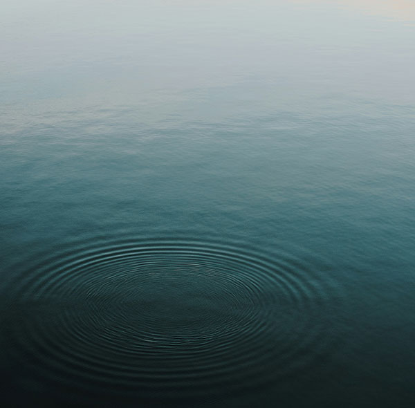
Calm Colours are tones that have a calming and relaxing effect on the viewer. They create an atmosphere of serenity and promote a feeling of inner peace. Such colours are ideal for bedrooms and living rooms as well as other areas where the focus is on relaxation and recreation.
But which colours belong to the world of Calm Colours?
Typically, these include colours such as
- Pastel blue: A light, soft blue that is reminiscent of the sky and radiates calm.
- Mint green: A delicate green that conveys freshness and harmony.
- Pale pink: A pastel shade of pink that is reminiscent of rose blossom and promotes relaxation.
- Beige: A neutral colour that conveys warmth and security.
- Light grey: A soft grey that radiates elegance and balance.
- Cream: A warm, light colour that creates cosiness and calm.
Why design wallpapers in Calm Colours?
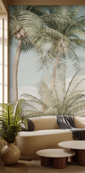
Wall murals are an excellent way to incorporate Calm Colours into your home. Unlike plain walls, wall murals with calm colours add texture and visual interest to your room. You can choose from a variety of colour tones such as soft blues, delicate greens and pastel pinks to create the mood you want.
Advantages of wallpaper in calm colours
- Relaxation: When you come home after a busy day, a room in calm colours will help to relieve stress and create a sense of calm.
- Room perception: Light colours make a room appear larger and more open, while darker tones convey cosiness and warmth. The colours can therefore be adjusted depending on the size of the room and the desired atmosphere.
- Creativity: Peace and relaxation are often the breeding ground for creativity. If there is a room in your home that is designed in such a way that it has a calming effect, creative ideas can be developed more easily.
- Longevity: Calm Colours are timeless and do not lose their appeal quickly. This means that you can enjoy a wallpaper in Calm Colours for a long time without having to constantly renovate.
Tips for using Calm Colours wallpaper
- Calm colours should be used in the bedroom to create a restful sleeping environment.
- Pastel-coloured wallpapers are ideal for children's rooms and create a calming atmosphere.
- In combination with natural materials such as wood and stone, Calm Colours are ideal for creating a harmonious overall look.
- Different patterns and textures can be used to add visual interest without detracting from the tranquillity of the colours.
- Light has a major influence on the perception of colours. It should therefore always be ensured that the lighting in the room is adjusted accordingly.
Calm Colours for every furnishing style?
The Calm Colours colour trend can also be integrated into different living styles. Here are some examples of how these warm colours can be incorporated into different living styles:
- Scandinavian style:
- Use pastel blue or mint green walls to emphasise the Scandinavian style. Combine the nuances with white furniture and natural wooden elements.
- Add grey or sand-coloured rugs and textiles to create warmth and cosiness.
- Minimalist style:
- Go for a neutral palette with light grey or cream-coloured walls and furniture.
- Accentuate the room with pastel pink or pastel blue decorative elements such as cushions or vases.
- Boho chic:
- Combine sand-coloured walls with eye-catching, colourful accessories such as rugs, cushions and wall hangings.
- Use pastel pink or mint green accents in the form of candlesticks or flowers.
- Industrial style:
- Contrast the rough industrial style with soft calm colours such as light grey or beige on the walls.
- Integrate metal accents in neutral colours to maintain the industrial flair.
- Country house style:
- Go for cream-coloured walls and complement them with pastel pink or mint green details in the form of crockery, cushions or curtains.
- Natural wooden furniture goes perfectly with this style and creates a warm and inviting atmosphere.
- Modern elegance:
- Use a mixture of light grey, beige and cream for the wall colours to create a sophisticated, elegant atmosphere.
- Add pastel pink or mint green accents in the form of artwork or fabrics to add a touch of colour and freshness.
In summary, wallpapers, designer wallpapers or photomurals in Calm Colours offer an excellent opportunity to create a relaxed and harmonious atmosphere in any home. With the right choice of colours and patterns, you can create an environment that calms the senses and conveys a sense of inner peace. So turn your living spaces into places where you can relax and unwind and be inspired by the power of Calm Colours wallpaper.